Want to be a data journalist? Learn these important tools
As
the world of journalism changes many journalists are looking to learn
new skills; skills better suited to an industry that is increasingly
digitised and visual. For many that probably entails learning something
about data journalism and visualisation. But, if you’re from a strictly
printed words background, the change can be daunting.
For
a start there is an ever-growing list of data journalism tools that are
available which can be daunting. The question becomes, where to start?
There
is no single right answer. What you need to do is to decide what it is
you want to achieve, and your particular working circumstances. If you
work in a newsroom and your primary output is in a newspaper then you
probably don’t need to learn to make interactive graphics. But if you
work online then you may want to learn some data visualisation tools.
The
important thing to understand here is that no matter what kind of
journalism you do you can benefit by learning some basic data journalism
techniques. And don’t be fooled by the all-to-often portrayal of data
journalists as code hackers. There is a place for great programmers but
you don’t have to be a programmer to be a data journalist.
What
follows is an opinionated list of tools worth taking the time to
explore. Most of these are tools I have come to rely on for a range of
different projects, such as data driven stories like this. This is not a comprehensive list of tools, just a shortlist that makes up a good toolbox.
Part 1: The data journalism basics
Spreadsheets
Yes,
you can’t escape it. Spreadsheets are the core tool for any data
journalism project. Too often journalists fall back on the old pretense
that they’re no good with maths. You don’t need a PhD in mathematics to
use a spreadsheet but a basic understanding of averages, means, medians
and the ability to work with a spreadsheet will boost your reporting
skills. If you’re completely new to spreadsheets there are many tutorialsonline that will have you up and running in no time.
For
most people the first thing they think of when they hear spreadsheets
is Excel, which is a great option but by no means the only one. Google Sheets
is preferred by many spreadsheet newcomers because its simplified set
of options give them the bits they need without the huge array of
functions in Excel. If you want something free but powerful, Libre Office spreadsheets is one of the best options.
Document organisation and collaboration
One of the challenges in doing data journalism is how to manage large numbers of documents without losing your way. Again, Google Drive
is a good starting point. Drive stores all of your documents in the
cloud and makes it easy to share these easily with other users. Drive
also has built in version tracking, although it’s not immediately
obvious, which means you can go back to previous versions of a document
if you end up in a data dead end or if you make a mistake.
While Drive has a ton of uses, sometimes you need something a little more focused on the task at hand. Which is where Document Cloud
comes in. Document Cloud is also an online document storage service but
it has a number of features that make it a great tool for data
journalism. One of the most useful of these is the ability to upload
PDFs to Document Cloud and have it convert these to text for you. Not
only that but Document Cloud also indexes documents and over time it
becomes possible to search across all your stored documents for
particular words or names. Document Cloud includes annotations, it can
build timelines from documents and makes it easy to embed portions of
documents into your online stories. Also, multiple users can collaborate
on the documents. Your newsroom will need to apply for an account but
the service itself is free for news organisations.
If you’re looking for something a little different to Document Cloud or Google Drive then it’s worth taking a look at Git and Github.
Git has largely been the domain of programmers but increasingly
journalists and other writers are turning to Git/hub for a range of
reasons. Git is a version control system. You can create files, edit
those while being able to revert to previous versions at any point. You
can also “branch” files which means creating a second or third version
of your files which you can experiment with. If these experiments work
out you can then “merge” the changes back into your main files. If not
you can dump the experiment and switch back to your original files. If
you’re keen to try out Git and Github then do yourself a favour and
watch Daniel Shiffman’s entertaining Git and Github for Poets YouTube series.
Collecting and cleaning data
The
other reality about data journalism is that it is a rare occasion when
you get to deal with clean data. Either you’ll be dealing with dozens of
PDF files that need to be converted into something useful and verified.
Or you’ll have a dump of messy CSV or excel files.
If
you’re looking to convert PDFs into text/numbers there are dozens of
good tools that do good to excellent conversions. The problem is that
PDFs are tricky things and your success converting them is largely based
on how they are created. PDFs that were created directly from
spreadsheets are typically easier to convert than PDFs that are actually
made by scanning in a document and then saving to to PDF. More often
than not you’ll deal with this latter type, especially if you’re getting
leaked data.
If
you’ve got a Document Cloud account this should be your first stop
because it has PDF conversion built in. If you’re looking to convert
just a portion of a PDF, or multiple similar portions of a document then
try Tabula.
With a little bit of practice Tabula can be made to do pretty reliable
PDF conversions, even if your data is spread throughout multiple
documents.
There are also a number of online PDF conversion tools that work with varying degrees of success. One of the more popular is CometDocs which does conversion to multiple file formats. Zamzar
offers a similar service. If you’re looking for something a little more
robust then Nitro is worth testing. Nitro offers a free online PDF conversion service
but it is also available as a paid-for desktop application. It’s not
cheap but it’s very capable if you’re dealing with multiple documents on
a regular basis.
Once
you’ve got your data probably need to clean it. If the data is not too
messy or detailed then a spreadsheet is a good starting place. But, if
you’ve got a file with hundreds or thousands of rows and multiple
problems then Open Refine
is the tool of choice. Open Refine used to be called Google Refine and
it makes it relatively easy clean up dirty datasets. One of its
strengths is its ability to work with just portions of your dataset at
time. For my money, if you’re going to commit to learn anything then
Refine would my choice. Once you’re over the initial learning curve and
you discover the power of Refine you won’t look back and there are some good introductory tutorials available for Open Refine.
A tool similar to Open Refine is Data Wrangler
which aims to make it as easy as possible to clean up and manipulate
large data sets. I’m not overly familiar with Data Wrangler so my
preference is for Open Refine but I mention it because it looks to be a
promising tool.
Part 2: Analysing and visualising data
Once
you’ve got your data cleaned and sorted you’ll want to see what the
data is telling you. If you’ve read anything about data journalism
you’ve probably heard someone say that you need to interview your data
like you would interview a source. Just because you’ve got a set of data
doesn’t mean you have a story. What you need to do is look at the data
in multiple different ways to see what stands out. Also, when you do
this you might well spot anomalies in the data, a sudden spike or dip in
values. Sometimes these are the stories but often these are the result
of a problem in your data.
One
of the easiest tools for doing a quick visualisation or two is Google
Sheets. Exel or Libre Office could also be used but Google Sheets is
perhaps the easiest of the tools when you’re looking for a quick chart.
It’s worth looking at your data in multiple different views to see what
the patterns look like.
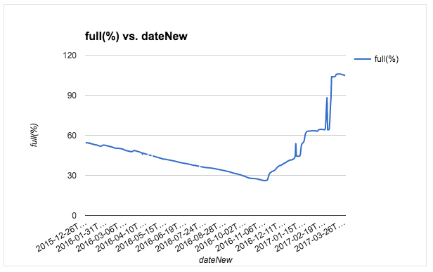
An
initial view of Vaal Dam levels for every day of the past year.
Visualising it this way makes it easy to spot anomalies or missing data
points. Those sudden spikes are very likely errors in the data rather
than actual spikes.
Another way to do initial visualisation is with one of a number of online tools. One of the easiest to use is Datawrapper
which outputs your charts in multiple different ways. It’s a useful way
to switch between different views quickly to get a sense of what works
well. There are a few other services online, such as RAW or Quartz’s Atlas charts which produce good results.
Once
you’ve got an idea of what you want to do then it’s time to start
creating. Most of the programs mentioned above will produce embeddable
versions of the charts you’ve made but they may be limited in adding
other elements like images, text areas or extra labels. For that you’ll
need to look at some other tools.
ogram
are among the best and easiest at doing this. Both make it easy to
combine charts with other visual elements, and if you start with one of
the pre-built templates you’ll have something decent looking in next to
no time.
If you’re looking for something more detailed with more than just a few default chart types then you should probably try out Tableau Public
which is free and extremely powerful. It can build everything from the
simplest charts to complete interlinked dashboards. But be warned, the
initial learning curve can be a little daunting for first-timers. If
you’re serious about data visualisation then take the time to learn more
about Tableau Public. But if you just want the occasional chart to
dress up a story then stick with one of the other options.
Part 3: Maps and mapping
If
you do any kind of data journalism you’re bound to come across
geographic data. Which brings up the issue of mapping tools, some of
which are simple point and click affairs while others border on the
arcane. So you need to think carefully about what you’re trying to
achieve with geographic data.
Too
often the first instinct is to plot the points on a map. Which is worth
doing in the initial exploratory stages in almost all cases, but often a
map is not the best way to illustrate the point of a story. For
example, having a map with 200 points all clustered around a small area
is often not the most informative way to display data. While shaded
contiguous areas to indicate some sort of distribution can be far more
effective.
Having said that, a good map done right can add huge amounts to a data story, so what are the best tools?
Once again Google is a good starting point. Google My Maps
is one of the simplest tools to use. It’s pretty intuitive to use and
makes it easy to look up geographic points, draw lines and shape on maps
and even add driving directions. If you just want to illustrate where
or how something happened geographically then there is no better place
to start.
A step up from My Maps is Google Fusion Tables.
This is also part of the Google Drive suite of tools. Fusion Tables in
fact does a lot more than just make maps, though that is one of its
strengths.
Fusion Tables also make it easy to filter data sets, do some
cleaning up of data, merge multiple datasets into one and a fair amount
more. It’s a little tricky at first but is a good choice when you’re
dealing with larger data sets.
If you’re really getting into this mapping thing and you want a bit more than the previous two options then CartoDB
is your next step. Carto is all about maps and it has the potential to
make excellent maps with multiple layers and different designs so long
as you’re prepared to put in a little initial work. Personally I find
Carto an excellent choice for mocking up a quick sample map or merging
sets of data to include geographic points. It makes it pretty simple to
visualise larger sets of data and make decisions about where you should
go with your project. Carto also makes it easy to export the cleaned and
fixed datasets into many formats which makes it easy to use in other
applications.
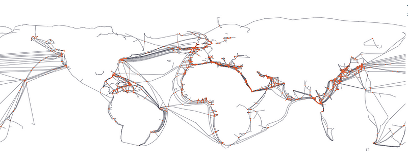
The world’s undersea cables as viewed in Mapshaper.org
There
are literally dozens of other applications for making maps some of
which are extremely powerful but often also very complex. ArcGIS is popular tool, as is the open source QGIS
application but both are aimed at fairly experienced mappers so the
learning curve can be steep. If you’re keen to try your hand at making
your own map styles then Mapbox is great for that. Mapshaper.org
is another of my most commonly used maps tools because it makes it easy
to get a quick visual representation of the data in your map files and
it also makes it easy to simplify map shapes, something that can be
extremely useful in keeping download times down.
In conclusion
Data
journalism is a broad area of work with place for many different
skills. Some might favour the visualisation side of data journalism
while others may prefer the mapping side. No matter what you prefer
doing or what the limitations of your newsroom are there is always
something more to be learned about data journalism. The recommended
route would be to start with the basics above and then gradually move
into some of the more detailed areas.
From
experience the best way to learn to become better at data journalism is
to practice. Find a real world dataset and see what you can make out of
it. It’s only when you’re working in a real world scenario that you’ll
really learn the ins and out of good data analysis.
Comments, thoughts, feedback? Leave a comment or find me on Twitter. Please recommend this article if you found it useful.
Programme:
The one that got away
29 dollars
Pasties and a G-string (not: Till the money runs out, as indicated on movie)
Tango
Invitation to the Blues / Eggs and Sausage
Mr. Siegal
Mathilda (Tom Traubert's Blues)